
A Los Angeles production studio. The work comes first.
Principles
Electra is a body of work, not a roster of names. Everything in this system pushes the footage forward and lets the brand recede.
The reel is the front door. Categories, not people, are the navigation.
Frames fill the screen. Chrome is thin. Negative space does the talking.
Client and director are stated quietly, in plain text. Never a headline.
One accent. Two typefaces. Slow, deliberate motion. Nothing extra.
Logo
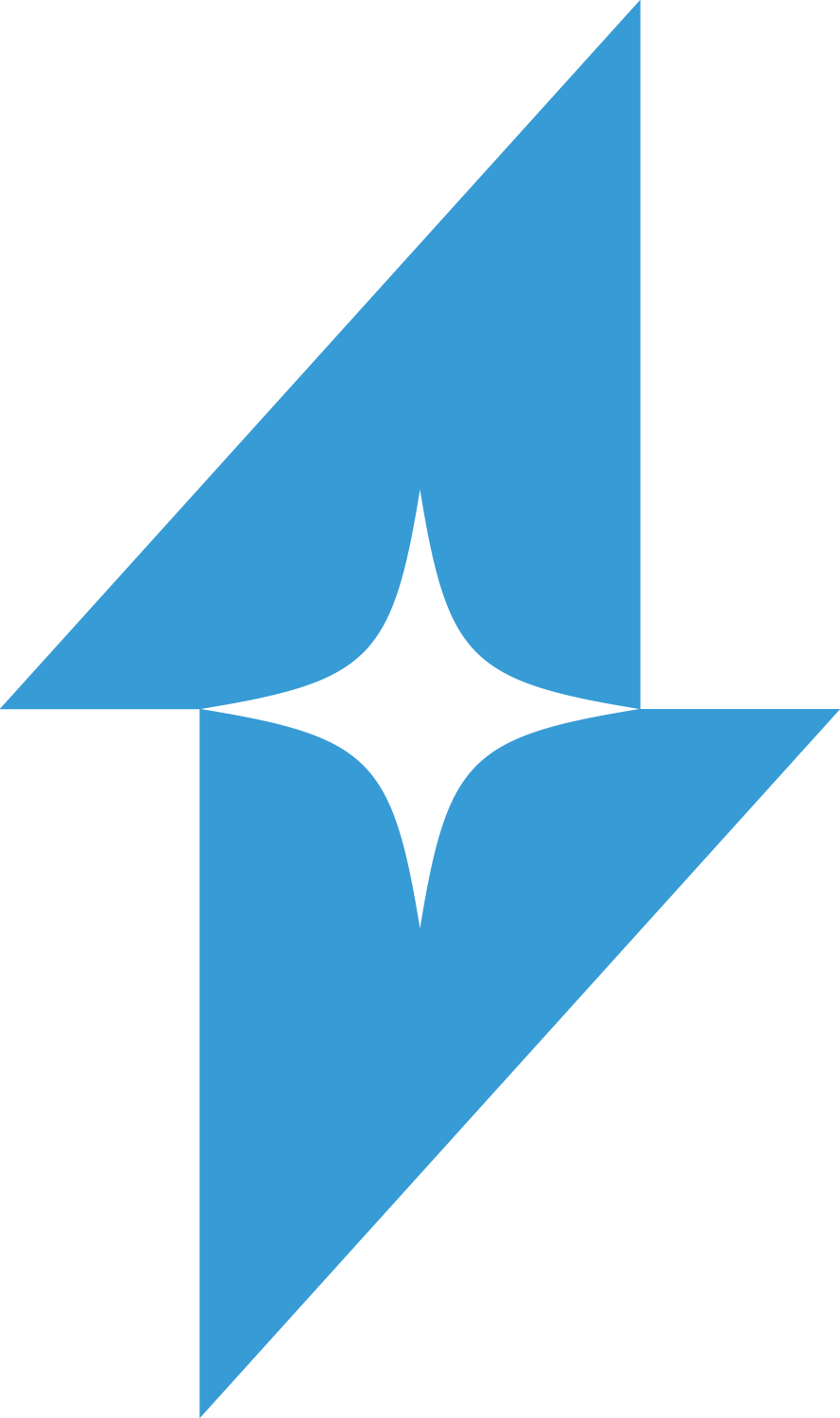
A four-point bolt — energy, light, the spark of a shoot. It is the single most recognizable Electra asset. Lead with it.
Keep clear space equal to half the bolt's height on all sides.
Never render the bolt below 24px tall on screen.
Orange on ink, ink on paper, white over footage.


The official wordmark integrates the bolt as its center letter. Orange on ink, white over footage, ink on paper. Never re-typeset it.


Color
One accent against a deep neutral ground. Orange is the spark; ink and footage are the room.
Typography
COMMERCIALS
NARRATIVE
Wide, deliberate, all-caps. Use rarely and large. Generous tracking.
The Plate — General Mills — dir. Lorenzo de Guia
Medium for body and credits. Bold for labels and the active state.
Quiet, functional, legible. Medium and Bold weights only.
Motion
Cinematic and unhurried. Smooth scroll (Lenis), fades over slides, and a logo that breathes. Motion should feel like a slow dissolve, never a UI tick.
cubic-bezier(0.77, 0, 0.175, 1)cubic-bezier(0.19, 1, 0.22, 1)Big reveals, scene changes, the reel.
UI feedback, hover, the logo blink.
Layout & System
Work categories are the navigation. Bolt centered, Contact right.
Posters at rest, footage on hover. Calm, scannable, generous gutters.
The film fills the frame. Title, client, quiet director credit.
Voice
Understated and factual. Name the work and the client. Whisper the credit. Never oversell.
- The Plate — General Mills
- Commercials. Narrative. Music Videos.
- A Los Angeles production studio.
- Award-winning, world-class storytellers!
- Meet our incredible roster of directors.
- We craft unforgettable cinematic journeys.
Downloads


Typefaces (Monument Extended, PP Pangram Sans) are licensed and not redistributed here. The full vector kit lives on the studio archive; this page hosts the web-ready essentials.